Website Accessibility for Small Business: A WCAG Guide for Canada
What website accessibility means, which Canadian rules apply to you, and a 12-step audit you can run yourself: keyboard, screen reader, contrast, alt text, forms and captions, plus fixes ranked by priority.
Website accessibility means building your site so people with disabilities can perceive, understand, navigate and use it: someone who is blind and uses a screen reader, someone who cannot use a mouse, someone with low vision who zooms to 300 percent, someone who is Deaf and needs captions. In practice, that means meeting the W3C's Web Content Accessibility Guidelines (WCAG) at Level AA, which is the standard Canadian rules point to.
You can find most of your site's accessibility problems yourself in an afternoon. This guide explains WCAG 2.1 and 2.2 in plain language, which Canadian rules apply to you (Ontario's AODA, the federal Accessible Canada Act and Quebec's standard for public bodies), and then walks you through a 12-step audit: keyboard test, screen reader smoke test, contrast, alt text, forms, captions and more. After that you get fixes ranked by priority, how to bake accessibility into design and copy, the free tools we use, and an ongoing checklist you can run every quarter.
What website accessibility means, and who it helps
Accessibility is about removing barriers. A barrier is anything on your site that stops someone from completing a task because of how their body or mind works: a menu that only opens on mouse hover, a "Submit" button that is just an unlabeled icon, light gray text on a white background, a video with no captions.
It is not a niche concern. According to Statistics Canada's 2022 Canadian Survey on Disability, 27 percent of Canadians aged 15 and older, or 8.0 million people, had one or more disabilities that limited their daily activities. Not all of those disabilities affect how someone uses a website, but many do: vision, hearing, dexterity, mobility, learning, memory and mental health conditions all change how people browse.
Who you are designing for
- Screen reader users, who navigate by headings, links and form fields, not by looking.
- Keyboard and switch users, including people with tremors, paralysis or repetitive strain injuries. Mouse-only features do not work for them.
- People who see differently: low vision, color blindness and age-related vision loss mean zooming, high contrast modes or giving up on faint text.
- People who process differently: cognitive disabilities, ADHD, dyslexia and anxiety make clutter, jargon, time limits and confusing forms much harder.
It helps everyone else too
Captions help someone watching on a bus with the sound off. Strong contrast helps someone reading their phone in sunlight. Clear labels help a contractor filling out your quote form one-handed in a truck. And descriptive headings, real text and meaningful link text are things search engines and screen readers both depend on. In our experience, sites that get accessibility right are easier to rank and convert, because the same discipline drives all three.
The size of the problem
Most websites fail. WebAIM tests the home pages of the top one million websites every year, and the 2026 WebAIM Million report found detectable WCAG failures on 95.9 percent of them, with an average of 56.1 detected errors per page. Six types of error made up 96 percent of everything found:
- Low contrast text (83.9 percent of home pages)
- Missing alternative text for images (53.1 percent)
- Missing form input labels (51 percent)
- Empty links (46.3 percent)
- Empty buttons (30.6 percent)
- Missing document language (13.5 percent)
That list is good news for a small business. The most common problems are also the easiest to find and fix, and you do not need a developer for half of them.
WCAG explained in plain language
WCAG stands for Web Content Accessibility Guidelines. It is published by the World Wide Web Consortium (W3C), the group that sets web standards, through its Web Accessibility Initiative. It is the reference point for almost every accessibility law in the world, including the Canadian ones below.
According to the W3C's WCAG overview, WCAG 2.0 was published in 2008, WCAG 2.1 in June 2018 and WCAG 2.2 in October 2023. Each version is built from testable "success criteria," which are pass or fail statements like "text has a contrast ratio of at least 4.5:1."
The four principles: POUR
Every WCAG success criterion sits under one of four principles. If you remember nothing else, remember these:
- Perceivable. People can take in the content with the senses they have. Images have text alternatives, videos have captions, text has enough contrast, and nothing relies on color alone.
- Operable. People can use every control. Everything works with a keyboard, focus is visible, people have enough time, nothing flashes in a way that could trigger seizures, and tap targets are big enough.
- Understandable. People can understand the content and how the site behaves. The language is set, labels are clear, errors are explained, and things do not change unexpectedly.
- Robust. The site works with assistive technology. Buttons are real buttons, form fields are properly labeled in the code, and custom components announce their name and state.
Levels A, AA and AAA: aim for AA
- Level A is the minimum. Failing one usually blocks someone completely.
- Level AA is the practical target. It adds contrast, visible focus, consistent navigation and clear error suggestions. Canadian rules and most contracts ask for AA.
- Level AAA is the strictest. Nobody expects a whole site to meet it; use individual AAA criteria where they are easy wins.
Decision rule: aim for WCAG 2.2 Level AA.
WCAG 2.0 vs 2.1 vs 2.2: which one should you target?
The versions are additive. The W3C states that content that conforms to WCAG 2.2 also conforms to WCAG 2.1 and WCAG 2.0, and it encourages everyone to use the latest version. So if your legal requirement is WCAG 2.0 AA (Ontario) or WCAG 2.1 AA (Quebec's public sector standard), meeting 2.2 AA covers you.
WCAG 2.1 added criteria for mobile and low-vision users: content that reflows on narrow screens, contrast for buttons and icons, adjustable text spacing, and support for both orientations.
What WCAG 2.2 added
The W3C's summary of what is new in WCAG 2.2 lists nine new success criteria and one removal. The ones at Level A and AA, which are the ones you need, are:
- 2.4.11 Focus Not Obscured (Minimum), AA. When an item gets keyboard focus, it must be at least partially visible.
- 2.5.7 Dragging Movements, AA. Anything that needs dragging (a slider, a sortable list, a map) needs a simple click or tap alternative.
- 2.5.8 Target Size (Minimum), AA. Buttons and links must meet a minimum size (24 by 24 CSS pixels) or have enough space around them.
- 3.2.6 Consistent Help, A. If you offer help (a phone number, chat, contact link), put it in the same place on every page.
- 3.3.7 Redundant Entry, A. Do not ask for the same information twice in one process.
- 3.3.8 Accessible Authentication (Minimum), AA. Do not make people solve a puzzle, recall a password from memory without allowing paste or password managers, or transcribe characters to log in.
WCAG 2.2 also removed 4.1.1 Parsing as obsolete, because modern browsers and assistive tech handle minor code errors on their own.
Website accessibility law in Canada
Canada does not have a single accessibility law that covers every business website. What applies to you depends on where you operate, how many people you employ and whether you are federally regulated. This is general information, not legal advice; if you are close to a threshold or have received a complaint, talk to a lawyer.
Ontario: the AODA website requirement
The Accessibility for Ontarians with Disabilities Act (AODA) has the most concrete website rule in the country. According to the Government of Ontario's guide to making websites accessible, these organizations must make their public websites accessible:
- Designated public sector organizations
- Businesses and non-profits with 50 or more employees in Ontario
As of January 1, 2021, public websites and web content must meet WCAG 2.0 Level AA, with two exceptions: success criterion 1.2.4 (live captions) and 1.2.5 (pre-recorded audio descriptions). The requirement applies to websites and web content published after January 1, 2012.
Under 50 employees, the website rule does not apply, but if you are growing toward 50, plan now. Retrofitting a site almost always costs more than building it in.
Ontario's guide also suggests keeping a record of resolved issues in case you are asked to show compliance. The audit log in Step 12 does exactly that.
Federal: the Accessible Canada Act
The Accessible Canada Act applies to the federal government and to federally regulated private sector organizations. According to the Government of Canada's summary of the Act, that includes government departments and Crown corporations, plus private sector bodies such as banks, broadcasting and telecommunications providers, and federal transportation providers.
The Act lists seven priority areas, and "information and communication technologies" is one of them, which is where websites, apps and digital documents live. Regulated organizations must:
- Prepare and publish an accessibility plan, consulting people with disabilities, and update it every three years.
- Set up a process for receiving and responding to accessibility feedback.
- Publish regular progress reports, including the feedback received and how it was considered.
The Act's goal is a barrier-free Canada by January 1, 2040, and the Accessibility Commissioner can issue penalties of up to 250,000 dollars per violation. If you run a local plumbing company, this Act does not apply to you directly. If you are a small trucking firm that crosses provincial lines, a credit union under federal charter or a telecom reseller, check carefully.
Quebec: the standard for public bodies
Quebec's government publishes the Standard sur l'accessibilité des sites Web (SGQRI 008 3.0), which took effect on April 29, 2024. It applies to public bodies covered by the province's law on information resource governance: ministries, agencies, school service centers, health institutions and similar organizations.
It requires WCAG 2.1 Level A and AA (except live captions and pre-recorded audio descriptions), three specific AAA criteria, and a set of WCAG 2.2 criteria including focus not obscured, dragging, target size and accessible authentication. It applies to new content from the design stage and to significant changes to existing content.
Private Quebec businesses are not bound by this standard. But if you sell to Quebec public bodies, expect accessibility requirements in the contract, and if you build a bilingual site, accessibility has to work in both languages. Our bilingual website guide covers the language side, including setting the page language correctly so screen readers pronounce French as French.
Other provinces, Alberta included
Manitoba, Nova Scotia, British Columbia, Saskatchewan and Newfoundland and Labrador have all passed their own accessibility acts, with standards rolling out on different timelines and mostly starting with the public sector. Alberta does not currently have a comparable provincial accessibility law for private businesses.
If you sell into the United States, the Americans with Disabilities Act is regularly applied to websites through lawsuits, and WCAG AA is the benchmark courts and settlements reference. Canadian businesses with large US customer bases should treat WCAG 2.2 AA as the baseline.
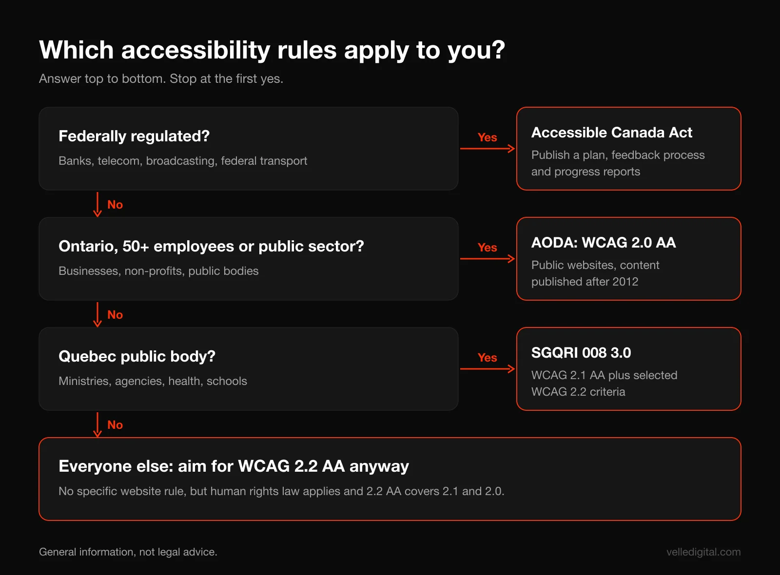
Decision rules: what applies to you
- If you are federally regulated: the Accessible Canada Act applies. You need a published plan, a feedback process and progress reports, and your website should meet WCAG AA as part of that plan.
- If you have 50 or more employees in Ontario, or are an Ontario public sector organization: WCAG 2.0 AA is a legal requirement for your public website. Aim for 2.2 AA.
- If you are a Quebec public body or sell to one: WCAG 2.1 AA plus the listed 2.2 criteria, per SGQRI 008 3.0.
- If none of the above apply: there is no specific website rule, but human rights law across Canada prohibits discrimination in services, and customers with disabilities are customers. Aim for WCAG 2.2 AA anyway, prioritizing the blockers in this guide.
How to audit website accessibility yourself: step by step
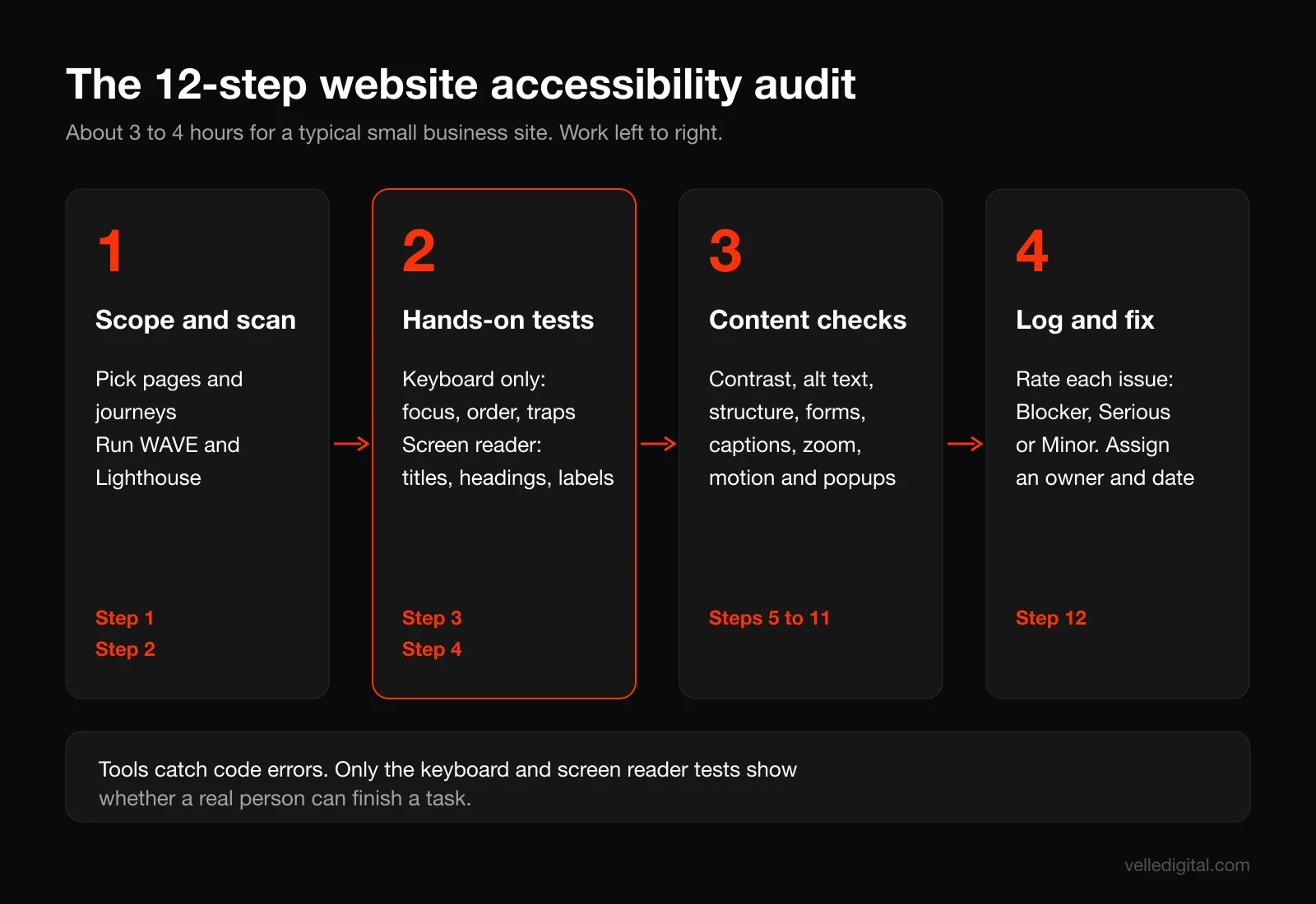
You do not need to be a developer to find most accessibility problems. The W3C's own Easy Checks page is designed for exactly this kind of first review, and it is honest about the limits: a page can pass quick checks and still have significant barriers. The steps below go further than a quick check, but they are still not a formal conformance audit. Treat them as the 80 percent that catches the problems hurting real users.
Set aside about three to four hours for a typical small business site. Open a spreadsheet with these columns before you start: Page, Issue, WCAG criterion (if you know it), Who it affects, Severity (Blocker, Serious, Minor), Fix, Owner, Status.
Step 1: Pick the pages and journeys to test
Do not try to test every page. Test a representative sample, plus every page someone must get through to become a customer.
- Your homepage.
- One of each page template: a service page, a location page, a blog post, the about page.
- Your contact page and every form on the site (quote request, booking, newsletter signup).
- Any checkout, booking or login flow, from the first click to the confirmation screen.
- Any page with video, a map, a carousel, an accordion, tabs or a popup.
Most small business sites are built from five to eight templates. If the service page template has a problem, every service page has it, so fixing the template fixes them all.
Step 2: Run an automated scan first
Automated tools quickly catch code-level issues: missing alt attributes, empty links and buttons, missing labels, low contrast, missing page language. They cannot tell you whether alt text is accurate or whether a form works with a keyboard. Use them to clear the easy stuff, then test by hand.
- WAVE. Paste a URL into WAVE from WebAIM or install the extension. Red icons are errors, yellow are alerts (a human should look), green are features. Click each icon for an explanation.
- Lighthouse. In Chrome, right-click, choose Inspect, open the Lighthouse tab, check Accessibility and run it. A score of 100 means the page passed the automated checks, not that it is accessible.
Run both on every page in your sample, log each unique issue once per template, and fix errors before reviewing alerts.
Step 3: Do the keyboard test
This is the single most revealing test, and it takes ten minutes. Put your mouse aside and use only these keys: Tab to move forward, Shift + Tab to move back, Enter to follow links and press buttons, Space for checkboxes and buttons, arrow keys for radio buttons and menus, and Escape to close popups.
Now do everything a customer would: open the menu and reach a service page, play a video, open an accordion, close the cookie banner, fill out and submit your contact form. Check each of these:
- Can you see where you are? Every focused element needs a visible outline or highlight. Missing focus styles are the most common keyboard failure we find, usually because a designer removed the browser default for looks.
- Is focus hidden behind something? A sticky header, chat widget or cookie banner covering the focused item fails WCAG 2.2's Focus Not Obscured criterion.
- Does the order make sense? Focus should follow the visual layout, top to bottom and left to right.
- Can you reach everything? Hover-only dropdowns, custom checkboxes and "click to expand" sections built from plain div elements are often unreachable.
- Can you get out? If focus enters a popup, video player or embedded map and you cannot Tab or Escape out, that is a keyboard trap: a Level A failure and a hard blocker.
- Is there a skip link? The first Tab press should reveal "Skip to main content," so keyboard users do not tab through 30 menu links on every page.
Tip: Safari on a Mac does not Tab to links by default. Test in Chrome or Firefox, or turn on "Press Tab to highlight each item on a webpage" in Safari's Advanced settings.
Step 4: Run a screen reader smoke test
You are not trying to become an expert screen reader user. You are listening for whether your key pages make sense without seeing them. Fifteen minutes is enough.
- Windows: download NVDA, a free, open source screen reader. Press Insert + Q to quit.
- Mac: use VoiceOver, built into macOS. Press Cmd + F5 to turn it on and off.
- Phones: VoiceOver (iOS) and TalkBack (Android) are in accessibility settings. Learn how to turn them off first, because they change touch gestures.
Run this script on your homepage, one service page and your contact page:
- Listen to the page title. "Home" tells the user nothing. "Furnace Repair in Edmonton | Northside Heating" does.
- Jump through the headings. Press H in NVDA, or open the VoiceOver rotor with Control + Option + U and choose Headings. You should hear a logical outline. If you hear nothing, your "headings" are just bold text.
- List the links. Press Insert + F7 in NVDA or use the rotor's Links list. Ten "Learn more" links, or "Link" with no name (an unlabeled icon), are failures.
- Listen to the images. Are they described sensibly, skipped when decorative, or read as "IMG underscore 4471 dot jpg"?
- Fill in the form. Each field should announce its label ("Phone number, required, edit text"). Submit with an error: is the error announced, or only shown in red?
- Try icon buttons. Menu, search, close and carousel arrows should have names like "Open menu." Just "Button" is a fail.
If any step confuses you, it confuses a screen reader user too, and they cannot glance at the screen to work it out.
Step 5: Check color contrast
Low contrast is the most common failure on the web, and it is easy to measure. Per the W3C's explanation of the contrast minimum criterion, at Level AA:
- Normal text needs a contrast ratio of at least 4.5:1 against its background.
- Large text (at least 18 point, about 24 pixels, or 14 point bold, about 18.5 pixels) needs at least 3:1.
- The thresholds are strict: 4.499:1 fails.
WCAG 2.1 also added a 3:1 requirement for non-text elements you need to see to use the page: form field borders, icons that carry meaning, focus indicators and chart elements.
How to test:
- Open the WebAIM Contrast Checker.
- Get the hex colors from your brand guidelines or with a free color picker extension.
- Enter the foreground and background colors and read the result.
- Check these combinations specifically: body text, gray "secondary" text, placeholder text inside form fields, text on your brand color buttons, links, text over photos or gradients, footer text, and form field borders.
Common traps we see:
- Light gray body text, like #999999 on white, which comes in under 3:1.
- White text on bright brand colors. Orange, yellow and light green buttons often fail. Darken the button or switch to dark text.
- Text over photos. Add a dark overlay and test the lightest part of the image.
- Pale placeholder text used as labels.
Also make sure color is never the only signal. A form that marks errors only with a red border, or a chart with unlabeled colored lines, fails people with color blindness. Add text, icons or patterns.
Step 6: Review images and alt text
Alt text is the text alternative a screen reader reads instead of an image. Missing alt text was the second most common failure in the WebAIM Million, and bad alt text is nearly as common as missing alt text.
Use the W3C's alt text decision tree as your rulebook. In short:
- Decorative images (background textures, stock photos that add no information, icons next to text that already says the same thing) get empty alt text, so screen readers skip them. In most website builders, there is a "decorative" checkbox or you leave the alt field blank on purpose.
- Informative images get a brief description of the meaning, not every detail. "Technician replacing a furnace filter in a basement" is better than "image of man."
- Functional images (a logo that links home, an icon button) describe the function or destination. Your linked logo should say "Northside Heating home," not "logo."
- Images of text must include that text in the alt. Better still, use real text instead of an image of text.
- Complex images like charts and infographics need a short alt plus the full information in the page text nearby.
Alt text rules of thumb: skip "Image of" (the screen reader already says "image"), keep it to a sentence or two, and never stuff keywords. Project galleries and before-and-after photos are informative, so describe what a customer would want to know.
Template: [what it shows] + [the detail that matters to the reader]. Example: "Finished backyard deck in cedar with built-in bench seating and black metal railings."
Step 7: Check headings, links and page structure
Screen reader users navigate by structure, the way sighted users scan. Fix the structure and you fix a lot of problems at once.
- One H1 per page that says what the page is about. On most sites the title is the H1.
- Headings in order. H2 for main sections, H3 for subsections inside them. Do not skip from H2 to H4 because you liked the size. Style is handled separately in CSS.
- No fake headings. Bold paragraph text that looks like a heading is not one. Use the heading setting in your editor.
- Descriptive link text. The link should make sense out of context. "See our furnace repair pricing" instead of "Click here." If design requires a short "Learn more" button, the developer can add a hidden accessible name like "Learn more about furnace repair."
- Page language set. The page code should declare the language (English, French or both). Missing language makes a screen reader read English with French pronunciation rules, or the reverse. WAVE flags this.
- Unique, descriptive page titles. Format: Page topic, then business name. Every page should be different.
- Landmarks. Header, navigation, main content and footer should be marked as such in the code. Most modern themes do this; WAVE shows landmarks under its Structure tab.
Step 8: Test every form
Forms are where accessibility problems turn directly into lost leads. Missing form labels showed up on about half the home pages WebAIM tested, and the contact form is usually the most important page on a service business site.
Check every form against this list:
- Every field has a visible label, not just placeholder text inside it.
- The label is connected to the field in the code. Click the label text: if the cursor jumps into the field, they are connected.
- Required fields are marked in text, not only with color or an unexplained asterisk.
- Errors are specific, next to the field and announced. "Enter a 10-digit phone number, like 780 555 0123," not "Invalid input."
- Errors do not wipe the form. Nothing loses leads faster than retyping everything.
- Autocomplete and input types are set, so browsers auto-fill details and phones show the number pad. This also helps with WCAG 2.2's Redundant Entry criterion.
- No puzzle CAPTCHAs. Use invisible spam protection or a honeypot field.
- Radio button groups have a group label, and the success message is announced.
Copy-ready error message pattern: [What went wrong] + [how to fix it]. "Email address is missing an @ symbol. Enter an address like name@example.com."
Step 9: Check video, audio and captions
If you have video on your site, it needs:
- Edited captions for pre-recorded speech. YouTube and Vimeo auto-captions are a starting point; they mangle names, places and technical terms.
- A transcript for audio-only content like podcasts. Transcripts also give search engines something to index.
- A spoken version of key visuals. If a price or phone number only appears on screen, say it out loud in the video.
- No autoplay with sound, and a visible pause button on any looping background video.
- A keyboard-accessible player, including the caption toggle.
Step 10: Test zoom, reflow and mobile
Many low-vision users zoom instead of using a screen reader.
- Zoom to 200 percent (Ctrl or Cmd and the plus key). Nothing should be cut off, overlap or disappear.
- Zoom to 400 percent on desktop. The page should reflow into a single column with no horizontal scrolling, per WCAG 2.1's Reflow criterion.
- Rotate your phone. The site should work in portrait and landscape.
- Check tap targets. Crowded footer icons, pagination and popup close buttons may fail WCAG 2.2's target size rule. We make primary buttons at least 44 pixels tall.
- Increase your phone's text size and reload. Text should grow without being cut off.
Step 11: Check motion, time limits and popups
- Auto-rotating carousels need a pause button, and most should not auto-rotate at all.
- Nothing flashes more than three times per second.
- Animation and parallax should respect the "reduce motion" setting. Turn it on in your Mac or phone settings and see if the page calms down.
- Time limits on sessions or booking forms must warn people and let them extend.
- Popups must move focus inside when they open, close with Escape or a labeled close button, and return focus to where the user was.
Step 12: Log, score and assign
Go back through your spreadsheet and set a severity for each issue:
- Blocker: someone with a disability cannot complete a key task. Keyboard traps, unlabeled form fields, CAPTCHA puzzles, a checkout button that is not a real button.
- Serious: the task is possible but painful or confusing. Low contrast body text, missing focus outlines, vague error messages, uncaptioned videos.
- Minor: annoying but not stopping anyone. A redundant link, slightly off heading order on a blog post, a decorative image with unnecessary alt text.
Assign an owner and a date to every blocker. Keep the log; if you are in Ontario, it is your record of resolved issues. If you want this rolled into a full site review that also covers speed, SEO and tracking, our website audit checklist uses the same spreadsheet format.
Website accessibility fixes, ranked by priority
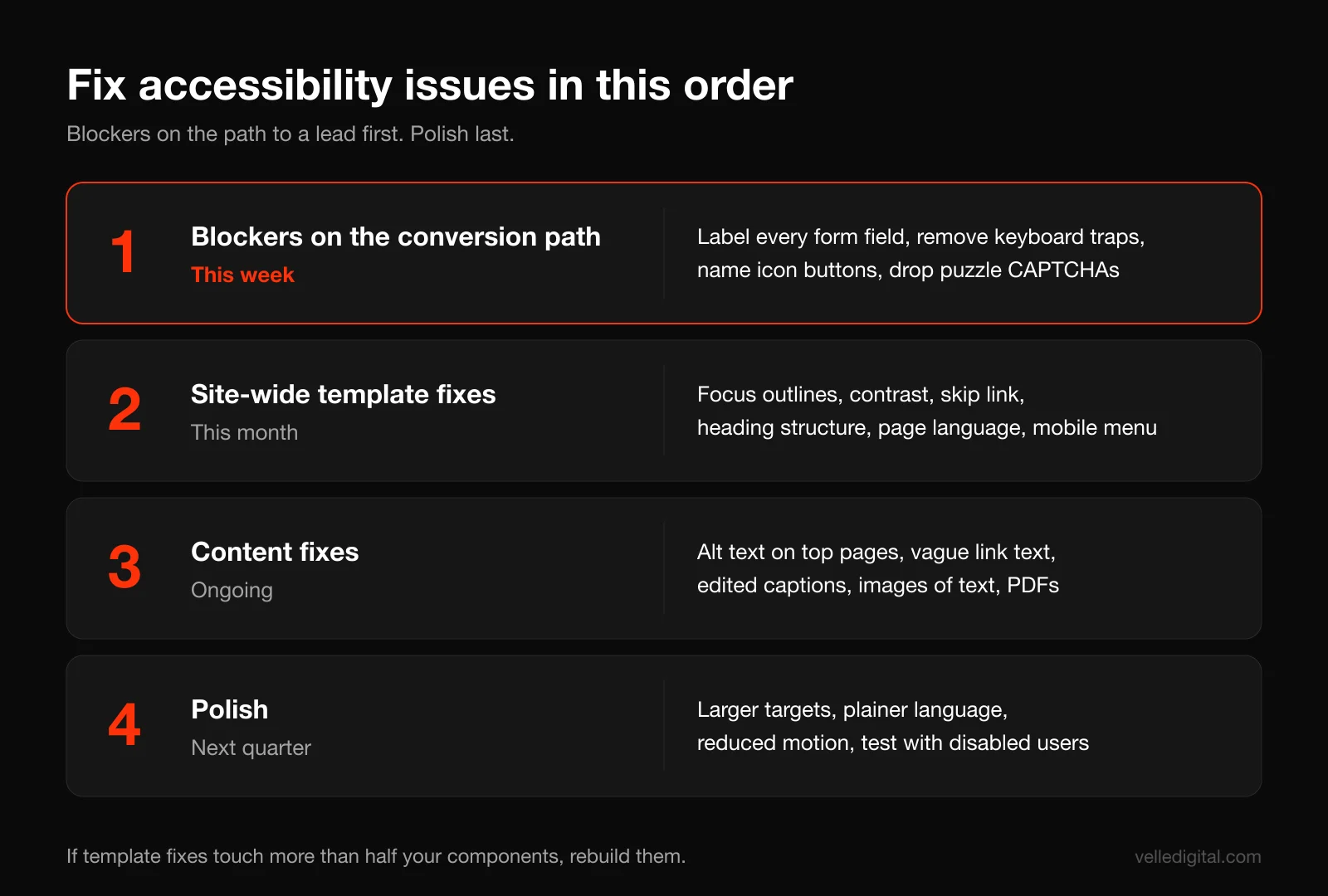
You will probably find more issues than you can fix this week. Fix them in this order: what blocks people from becoming customers first, what affects every page second, and polish last.
Priority 1: Fix blockers on your conversion path (this week)
These stop people from contacting or paying you. Fix them before anything else.
- Label every form field and connect labels in the code. Most form builders (Gravity Forms, HubSpot forms, Webflow, Squarespace) do this correctly if you fill in the label setting instead of using placeholders.
- Remove keyboard traps in popups, embedded booking widgets and video players. If a third-party widget traps focus, ask the vendor for an accessible version or replace it.
- Make every control a real button or link. Clickable divs and spans look like buttons but cannot be reached by keyboard or understood by screen readers. This is a developer fix, usually small.
- Name icon-only buttons: menu, search, close, carousel arrows, social links, cart.
- Replace puzzle CAPTCHAs with invisible spam protection.
- Make error messages specific and announced.
Priority 2: Fix site-wide template issues (this month)
These affect every page, so one fix in the template solves the problem everywhere.
- Restore visible focus outlines across the site, and make sure sticky headers and banners do not cover them. A 2 to 3 pixel outline in a color with at least 3:1 contrast against the background works on almost any design.
- Fix contrast in your global styles: body text, secondary text, buttons, links, footer.
- Add a skip link and correct landmarks in the header template.
- Fix heading structure in templates, so the page title is the H1 and section headings follow in order.
- Set the page language (and the language of any French or other-language sections).
- Fix the mobile menu so it opens with Enter, announces whether it is open or closed, and closes with Escape.
Priority 3: Fix content issues (ongoing, page by page)
These live in your content, so your team can fix them without a developer.
- Write or fix alt text on images, starting with your top 20 pages by traffic.
- Rewrite vague link text like "click here" and "read more."
- Edit auto-captions on videos and add transcripts.
- Replace images of text (flyers, menus, price lists uploaded as JPGs) with real text. A PDF menu or price list is a common culprit; at minimum, add the same information as page text.
- Fix PDFs you link to, or provide the same content as a web page. Scanned PDFs are just pictures to a screen reader.
Priority 4: Polish (next quarter)
Larger targets, simpler language on key pages, reduced-motion animations and, most valuable of all, a test session with a disabled user, which teaches you more in an hour than any tool.
Decision rule: if your site is on an old theme with dozens of serious template-level issues (no real buttons, no focus states, no headings, inaccessible menus), it is often cheaper to rebuild templates than to patch them. That is a judgment call we make often during a website redesign: if template fixes would touch more than about half the components, build them properly instead.
How to build accessibility into your design
Accessibility is far cheaper at the design stage than after launch. Good UI and UX design treats these rules as constraints from the first wireframe, the same way it treats screen sizes:
- Choose a palette that passes. Test every text and background pairing in your brand palette, then record which colors can carry body text, which can carry large text only and which are decorative only. Put that list in your brand guidelines.
- Design every state. Each interactive component needs default, hover, focus, error and disabled states. Do not leave focus to chance.
- Use readable type. Body text at 16 pixels minimum, line height around 1.5, no thin weights for body copy.
- Design generous tap targets. Primary buttons at least 44 pixels tall on mobile, with space between adjacent links.
- Never use color alone. Underline links in body copy, pair errors with an icon and message, label chart lines.
- Keep layouts predictable. Navigation, help and contact details in the same place on every page.
- Avoid hover-only content, and design a reduced-motion version of any animation.
In development, native HTML elements (real buttons, links, labels, headings) should come before custom components. Custom dropdowns, date pickers and sliders are where most serious accessibility bugs live. When we handle website development, we test keyboard access and screen reader names on every component before it reaches a page, because fixing a component once is far cheaper than fixing 40 pages later.
How to write accessible copy
Accessible writing is clear writing. It helps people with cognitive disabilities, people reading in their second language and everyone skimming on a phone. Our website copywriting guide goes deeper; these are the accessibility-specific rules:
- Lead with the point in every page, section and paragraph.
- Use plain words and short paragraphs. "Use," not "utilize." Explain industry terms the first time.
- Write link text that makes sense alone, and warn people when a link opens a PDF: "Download our 2-page price sheet (PDF)."
- Write button labels as actions. "Get my free quote," not "Submit."
- Do not rely on sensory or positional instructions. "Click the green button on the right" fails screen reader and color-blind users. "Select Book Now below" works for everyone.
- Avoid long runs of all caps, which are harder to read and sometimes spelled out letter by letter.
- Write dates unambiguously. "October 18, 2026" beats "18/10/26," which reads differently in Canada, the US and Europe.
Website accessibility testing tools
Beyond WAVE, Lighthouse, the WebAIM Contrast Checker and the screen readers above, add these free tools:
- axe DevTools browser extension (free tier): another automated checker with clear explanations, popular with developers.
- Chrome DevTools vision emulation: under the Rendering tab, simulate color blindness and blurred vision.
- Your keyboard, browser zoom and phone text size settings: still the most useful tools on the list.
What the tools cannot do: tell you whether alt text is accurate, whether instructions make sense, whether the focus order is logical, whether error messages help or whether a custom component behaves correctly with a screen reader. That is why Steps 3 and 4 matter more than any score.
If you would rather have a professional run the full review, a website audit from our team includes manual keyboard and screen reader testing alongside the automated checks, with a prioritized fix list.
Publish an accessibility statement and feedback process
Even if no law requires it, an accessibility statement shows good faith and gives people a way to tell you when something is broken. For federally regulated organizations, a feedback process is required. Link it from your footer. A template you can adapt:
- Commitment: "[Business name] wants everyone to be able to use our website. We aim to meet WCAG 2.2 Level AA."
- Status: "We last reviewed this site on [date]. Known issues we are fixing: [list, with expected dates]."
- Contact: "If you have trouble using this site or need information in another format, contact [name] at [email] or [phone]. We respond within [2 business days]."
- Alternatives: "You can also book or request a quote by phone at [number], [hours]."
Then make sure someone actually reads that inbox. A feedback email address that goes nowhere is worse than none.
Common website accessibility mistakes
These come up on almost every audit we run:
- Treating a Lighthouse score of 100 as "accessible." Always do the keyboard and screen reader tests.
- Removing focus outlines for looks. Restyle the outline instead of removing it.
- Adding an accessibility overlay (a toolbar script that promises instant compliance) instead of fixing the code. An unlabeled field is still unlabeled underneath.
- Text baked into hero images, often including the main headline and offer.
- Inaccessible third-party widgets: booking tools, chat, reviews, maps. You are responsible for the experience on your site, even if a vendor built the widget. Test before you sign up.
- Fixing once and never checking again. Every new page, plugin and blog post can introduce new issues.
- Making it a launch task instead of a design rule. Accessibility added at the end costs more and gets cut when the deadline arrives.
Accessibility also overlaps with performance: a page that takes ten seconds to load on a slow connection is a barrier too, especially for people using older devices. Our website speed optimization guide covers that side.
Ongoing website accessibility checklist
Accessibility is not a one-time project. Use this checklist when you publish and on a set schedule.
Every time you publish a page or post:
- Unique, descriptive title and one H1, with headings in order.
- Accurate alt text on informative images; decorative images marked decorative.
- Descriptive link text, and no text baked into images.
- Edited captions on video, transcripts for audio.
- Text over images or colors passes contrast.
- New forms have visible, connected labels and specific error messages.
Every month:
- Run WAVE on your homepage, contact page and any pages changed this month.
- Do a 5-minute keyboard pass through your main conversion path.
- Check your accessibility feedback inbox and log any reports.
Every quarter:
- Full keyboard test on every template.
- Screen reader smoke test on homepage, one service page and the contact or booking flow.
- Contrast check on any new brand colors, buttons or campaigns.
- Test any new plugins, widgets or third-party embeds.
- Update your accessibility statement with fixed and known issues.
Every year, or after a redesign:
- Full 12-step audit from this guide, plus a check for WCAG or legal updates in your province or sector.
- Train anyone who publishes content on alt text, headings, links and captions.
Frequently asked questions
Is website accessibility a legal requirement in Canada?
It depends on who you are. In Ontario, public sector organizations and businesses or non-profits with 50 or more employees must meet WCAG 2.0 Level AA under the AODA. Federally regulated organizations have obligations under the Accessible Canada Act, and Quebec public bodies must follow SGQRI 008 3.0. Other businesses are not bound by a specific website rule, but human rights law prohibits discrimination in services across Canada.
What WCAG level should a small business aim for?
Aim for WCAG 2.2 Level AA. It is the current version, it is what Canadian rules and most contracts reference in some form, and content that meets 2.2 also meets 2.1 and 2.0. Do not aim for AAA across the whole site; use individual AAA criteria where they are easy.
How much does it cost to make a website accessible?
It depends on the size of the site and how it was built. Content fixes like alt text, link text and captions cost mostly staff time. Template fixes like focus states, contrast, menus and form labels are usually a few days of developer work on a small site, while an old theme with many custom components may be cheaper to rebuild than patch. Building accessibility in from the start costs much less than retrofitting.
Can an automated tool tell me if my website is accessible?
No. Tools like WAVE and Lighthouse catch code-level issues such as missing labels, missing alt attributes and low contrast. They cannot judge whether alt text is accurate, whether the keyboard order makes sense or whether a form is usable with a screen reader. Use automated tools first, then test manually with a keyboard and a screen reader.
Do accessibility overlays or widgets make my site compliant?
We do not recommend relying on them. Overlays add a toolbar on top of your site but do not fix the underlying code, so unlabeled fields, missing headings and keyboard traps remain. Fixing the actual issues is the only reliable route to an accessible site.
Does website accessibility help SEO?
Yes, indirectly. Many accessibility practices overlap with good SEO: descriptive page titles, a clear heading structure, meaningful link text, real text instead of images of text, transcripts for video and fast, mobile-friendly pages. Accessible sites also tend to be easier to use, which helps conversions.
How often should I test my website for accessibility?
Check every new page or post as you publish it, run automated scans and a quick keyboard pass monthly, do a fuller keyboard and screen reader test every quarter, and run a complete audit once a year or after any redesign. New plugins, widgets and content are the most common way accessibility breaks after launch.
Make your site work for every customer
Website accessibility is not about chasing a perfect score. It is about making sure every person who wants to hire you can read your pages, fill in your form and get in touch. Start with the keyboard test and your contact form this week, and work down the priority list from there. If you would rather have it handled, we build accessible sites from the first wireframe through our website development service and can audit and fix the site you already have. Tell us about your site and we will show you where to start.